“Color becomes contemporary as it moves away from indexicality, symbolism, codification, and ideation because this move away from signification allows color to register traces of a much more complex series of historically specific conditions and forces: those of technology, sensibility, capital, taste, materiality, manufacture. In other words, when working through the field of effects, color can do more to engage contemporaneity than when it works through the structures of meaning.”
Sylvia Lavin “What Color is it Now? 2004”
“颜色具有当代性,当它从索引、象征意义汇编以及观念中移除,从某种意义上因为这一举动让颜色更能追溯历史特定条件和环境下的一系列复杂性:技术,感知,资本,风格,质感,制造。换句话说,通过特效领域的工作,颜色可以更好地切合当代性的特质相对于它本身通过色彩结构的定义来工作。”
Sylvia Lavin “当今的颜色是什么?”,2004
“Color can be used in different ways: thin or thick, one-dimensional or layered. The thicker the color and the more layers the greater the variety of impressions and effects.”
Liisa Aholainen & Bas Gremmen “The Thickness of Color”, 2009
“颜色可以用不同的方式:薄或厚,一维或分层。颜色越厚,层数越多就有各种更大不同的影响和特效。”
Liisa Aholainen & Bas Gremmen 颜色的厚度, 2009

Left to right: drawings by Joe Sacco, Bill Plympton and Richard Sala. Stroke patterns in many sketch drawings like these are laid out in image space and do not follow the 3D shapes depicted by them. They control the painterly effects subjectively.
从左到右:绘画者Joe Sacco, Bill Plympton 和 Richard Sala。排线图案在很多像这样的手绘图中都被展现出空间感,它们没有跟随刻画的三维造型。他们主观地控制着绘画的特效。
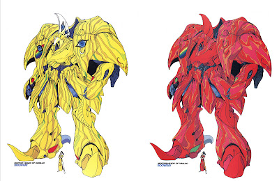
The Five star Stories by Nagano Mamoru
As a tool color has been practiced directly by artists and designers in order to develop their own styles. In architecture color is an important means of expression.
五星物语 Nagano Mamoru
颜色作为一个工具被艺术家和设计师直接运用于创作他们自己的风格。在建筑中,颜色是一个非常重要的表达方式。

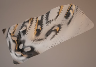
zebra’s tattoo patterns
The color of zebra’s tattoo patterns disrupt its volumetric surface, but also encase and delineate. Marking a change in direction at the juncture delicately change scale to conform to the narrowness of leg.
斑马的纹身图案
斑马的纹身图案色彩混淆了它的表面体积,但又包住并且描绘形体。在结合点改变方向,优美的尺度改变来顺应腿部的纤细。
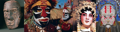
Left to right: Hand-carved by a Maori craftsman,depicts traditional facial tattoos;Papua facial ornamentation;Chinese opera facial masks ornamentation.
The Papua facial treatments, the craftsman’s tattoos and the Chinese opera facial masks work with the accentuating enhancement of facial features. Both sets of enhancements serve as mediums of distinction. In the case of the craftsman’s tattoos, there exists an elaborate system of typical characters. All of the surfaces are topological diagrams, an expression of organic structure. Color both conforms and transforms, sometimes it transforms by conforming.
巴布亚脸谱,工匠的纹身,还有中国脸谱都增强了面部的特征。所有的增强都有不同方式的区别。在工匠的纹身中,存在一个复杂的独有的特征系统。所有的结构都是拓扑式的原型,一个有机结构的表达。颜色可以同时顺应或者改变,有时候通过顺应来改变。
精练的现代主义文化剥离所有多余的结构体系,标榜为纯净和真实,其中大部分,清除所有颜色的类型。因此,典型的现代主义建筑崛起,陶醉在一个永恒的粉饰。事实上,通过各种文化,白色象征着纯洁,完美和无暇,并作为一种教育的标志,它诉诸于智力。因此,理念降低了色彩的使用,导致了更少区域的“不纯净”,不值得信任的现实。
然而,当代建筑的有效性依赖于不纯净,不寻常,叛逆以及影响力。当代建筑装饰表面,它欺骗,它伪装,它扩张,它变化,它产生的气氛与情绪并且色彩就是一个最好的载体来完成这些效果。现代派chromophobia到当代派chromophilia的过渡回应并建立在几百年前从文艺复兴时期到巴洛克时期的类似转型之上,浮雕式灰色装饰画画法给明暗对比画法让路,被富有动态的色彩所强化,给巴洛克艺术与建筑带来了特有的绘画质感。

Chiaroscuro describes an invention in the art of painting to create the illusion of volumes in space. The gradation effected from the light to the shadowed side of a three dimensional object. For example in the Clarinet Player, by Picasso, a pyramidal form implies an image. The pyramid has a strong contour to give the sense the figure is standing in a deep space. The Portuguese, by Braque, uses a highly developed interlacing of horizontal and vertical gridding created by gapped lines and intruding planes that create shallow spaces. Only gradually is the observer able to invest this space with depth permitting the figure to assume substance.
明暗对比画法描述了一种发明在绘画艺术中,在空间中创造体量的幻觉。一个三维物体从亮面到阴影面的渐变效果。比如在《单簧管演奏手》,由毕加索创作,一个锥形体表示一个图像。锥形体有很强的轮廓线给人以一种感觉,如同日整个造型站立于一个很深的空间。《葡萄牙》,由巴洛克创作,使用了高度成熟的由间距的线和交叠的平面所组成的横向和竖向交叉的网格来创造浅的空间。只有渐变才能让观测者可以感受这种空间以深度的造型在虚假的物体中。

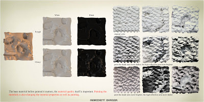
The base material before painted it matters, the material quality itself is important. Painting the materials is also changing the material properties as well as painting.
在绘画之前的基础材料有很强的关联性,材料本身的质感非常重要。喷绘材料在绘画的同时也改变了材料的属性


